Halfway through assembling the bus stop. Much patience and precision is needed to accomplish this model. Who knew modelling an actual thing can be so difficult? Wish me luck!
Thursday, 8 December 2011
Thursday, 10 November 2011
Digital Sketches on Bus Stop Design
BACK VIEW + POSTER

FRONT VIEW + POSTER

FRONT AND BACK POSTER DESIGN
SIDE VIEW + COLOUR TEMPLATES
FRONT ROOF BANNER DESIGN
Tuesday, 8 November 2011
#9 Bus Stop Advertisement III
Ideas on for my bus stop design. I would like to do something extreme as though the picture actually popping out. This is a simple example of what I want to do. I really want to present "extreme" of Perodua's latest product MyVi Extreme.
Imagine one of the photos above, doing something like the Smart advert on a bus stop. Extreme but seems interesting, right? However, still considering.
#8 Bus Stop Advertisement II
I have concluded that what make the advertisement really special and attractive is the creativity and uniqueness of the advert. Usually, what makes it much greater and different from other simple advertisements is that it applies things that are realistic to audience, where they can actually experience the product itself.
Ikea. The advertisers actually placed real furniture to represent Ikea so that people can experience it as though they are sitting in living room with a comfortable sofa and a nice stand lamp.
Coca-cola New Grip Bottle. I definitely find this advertisement very amusing. Who would have thought of actually putting the material that instantly grip on your clothes? Well, Coca-cola advertisement does! It does attract the people at the bus stop to recognize the new product while gripping their clothes when they were leaning on the poster. Hands down, great example of bus shelter advertisement.
#7 Bus Stop Advertisement
Having an advertisement at the bus stop will highly attracts passer by, usual bus passengers or your targeted audience. This is because people especially those who waits for their bus will be attentive to the surrounding of the bus stop. Therefore, advertisers who placed their advertisements there will have the potential to gain more audiences besides having it placed on billboards or any such medium.
For an example, the Amnesty International. This really does attract people to view the advert as it tends to change picture by sensing whether people are watching or not from a sensor camera.
I find this advert really interesting as it is rather rare to find such advert like this nowadays where it really does lots of effort in making a great advert.
#6 Local Brand/Product
I've chosen Perodua's MyVi Extreme 1.5 for my Environmental Design project. I find that doing the advertisement of Perodua's MyVi for the bus stop would be interesting to do and explore.
This is the product that I will be furthering my research on for the bus stop project.
However, by far, I've only found a few basic advertisement for the product. Most of it are banners but I'll keep crossing my fingers, in hopes, that I will more advertisement and sources to apply on my design.
Monday, 24 October 2011
#5 Information Counter
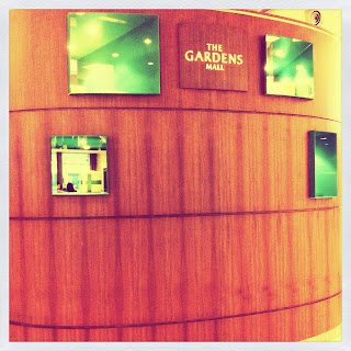
This photos were taken from The Gardens next to Mid Valley Megamall. I took the Information Counter at The Gardens Mall for an extra reference.

I find the counter very classy and attractive. It does represents the quality of The Gardens Mall. It look very high end like those type of counters you see in a hotel. Its small and has a very simply design. It is placed at the entrance of the mall which is very convenient for tourists and visitors.
*Front view
*Top view
*Back view
#4 Information Counter and Kiosks I
These are the Information Counter and Kiosk from Tropicana City Mall. The pictures are barely at its clear view but however, this is clearest shots of the counter and kiosk I could get.

The Information Counter in Tropicana City Mall is very simple and its easily spotted. I find very interesting that they placed a huge banner above the counter for visitors to find. The simplicity of the counter is very casual as it is in a rectangular shape. Plus, the colour really does imply the theme of the shopping with blue, white and green colour base.

These are the kiosk or also known as a directory of the complex in Tropicana City Mall. The kiosk is big and very clear for everyone to view. And I also admire its simplicity as well. Nothing looks more attractive with a touch of simplicity.
Thursday, 20 October 2011
#2
This blog will be a part of my studies for Environmental Design. Its still new but soon will be flooded with lots information and materials on Environmental Design. So stay tuned!
Subscribe to:
Comments (Atom)


